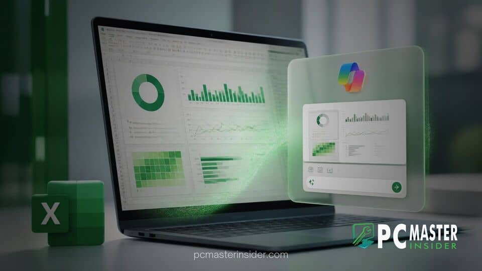
Microsoft has announced a new feature for its spreadsheet application called Copilot Canvas, which allows users to convert raw spreadsheet data into interactive visual dashboards. Listed on the Microsoft 365 roadmap under Feature ID 569424, the tool automatically generates visual charts, key performance metrics, and actionable summaries directly from workbook data.
The feature addresses a long-standing challenge in spreadsheet management by keeping generated visualizations permanently synchronized with the underlying source data. Rather than requiring manual updates or complex chart rebuilding, the interactive canvas refreshes dynamically whenever users edit values or append new records to their spreadsheets.
Interactive AI Dashboards in Microsoft Excel
Microsoft described the tool as a Copilot-generated workspace designed to give users a polished, interactive view of key visualizations, metrics, and insights. Rather than forcing users to manually construct individual PivotTables or apply custom formulas across multiple sheets, Copilot Canvas brings all essential visual elements into a unified workspace.
Users can customize their visual dashboards through natural language prompting. By asking questions or giving conversational instructions in the chat pane, individuals can alter chart types, filter specific metric breakdowns, or request deeper analytical overviews without digging through standard Excel ribbon commands.
How Copilot Canvas Transforms Workbook Data
Historically, converting raw tabular information into executive-ready presentations required significant manual effort. Users had to organize raw data ranges, create individual charts, configure slicers, and arrange layouts by hand. Copilot Canvas automates this entire pipeline by scanning raw tables, detecting structural patterns, and deciding the most effective visual layout automatically.
The Canvas interface functions as a dedicated visual layer over the workbook. Instead of creating scattered chart objects directly on top of raw numerical cells, the AI generates a consolidated layout containing key metric cards, trend lines, and comparison charts tailored to the dataset. This separation ensures that raw data entry remains clean and uncluttered while providing a high-level visual interface for management reporting.
Automatic Data Syncing and Visualizations
One of the primary friction points in traditional reporting workflows is data drift. When underlying numbers change in a standard static report, charts often require manual reconfiguration or recalculation. Copilot Canvas mitigates this issue through active background data binding.
Because the AI-generated canvas maintains an active link to the underlying source cells, any edits, data refreshes, or row additions immediately trigger visual updates across the entire dashboard. If a finance manager updates quarterly revenue figures or an operations team logs new inventory levels, the visual indicators and summaries recalculate automatically in real time.
Business Impact and Workflow Integration
The addition of Copilot Canvas fits into Microsoft's broader strategy of expanding generative AI assistant capabilities across the productivity suite. In recent months, Microsoft has updated its software ecosystem extensively, introducing new management features like controls for autonomous agentic AI systems and expanding automated IT management solutions such as Windows Autopatch for quality updates.
For enterprise organizations, automated dashboard creation reduces the technical barrier to sophisticated data analysis. Users who lack advanced skills in VLOOKUP functions, Power Query, or complex macro scripts can now construct functional dashboards in minutes. Teams that rely heavily on shared financial models, marketing performance trackers, or supply chain logs can share a single canvas view that accurately reflects live performance without constant human maintenance.
The feature also complements recent usability updates across Microsoft desktop environments. As Microsoft addresses minor desktop issues, such as fixing Windows 11 update settings bugs or refining user experiences by offering options to disable Bing web results in Windows Search, the core focus remains on streamlining daily workflows and eliminating repetitive task friction.
Availability and Rollout Timeline
According to the official Microsoft 365 roadmap, Copilot Canvas is marked as currently in development, with initial general availability target windows beginning across desktop and web versions of Excel. The capability will be accessible to enterprise customers and individual users holding active Microsoft 365 Copilot subscriptions.
As rollout plans progress across release channels, Microsoft is expected to refine conversational steering options and add support for broader file formats and external enterprise data connectors.
In summary, Copilot Canvas represents an important evolution for data visualization in Excel. By combining natural language prompts with continuous data synchronization, the feature eliminates manual reporting overhead and offers a flexible, auto-updating presentation layer for complex datasets.